Get-harder Site Review
Last Updated: 27-May-2026
Flirtyai.net
get-harder.today

Datingtools.ai
Get-harder
get-harder.today
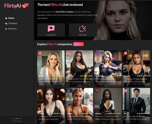
Get Harder AI drops you straight into a dark themed interface built around character cards and chat. The whole thing feels like a hub for NSFW AI conversations rather than a traditional video or gallery site. Character previews are front and center, with different styles laid out as tiles so you can scan faces and vibes at a glance before diving into anything. The overall look is pretty minimal, more about the grid of options than big banners or long text, which gives it a kind of app like feel instead of a classic adult tube layout.
Once you start poking around, navigation is fairly straightforward, since the main focus is just picking a character and chatting. The dark layout helps keep your eyes on the cards and sections, so it is easy to scroll through and compare options. On the flip side, a noticeable chunk of the homepage is taken up by promos and pushes toward premium messaging, which can break the flow a bit if you are just trying to explore what is available. It does not feel completely overloaded, but the upsell presence is hard to ignore and makes the free browsing side feel a little cramped. Overall, this setup will probably work best for people who like simple, tile based browsing and want to try AI chat with visual character previews, and who do not mind seeing premium offers mixed into the main page.


 Character previews are visible right away, so users can quickly decide what style interests them
- The dark layout keeps attention focused on the character cards and browsing sections
 Character previews are visible right away, so users can quickly decide what style interests them
- A lot of the homepage space is dedicated to promotions and premium messaging
 A lot of the homepage space is dedicated to promotions and premium messaging